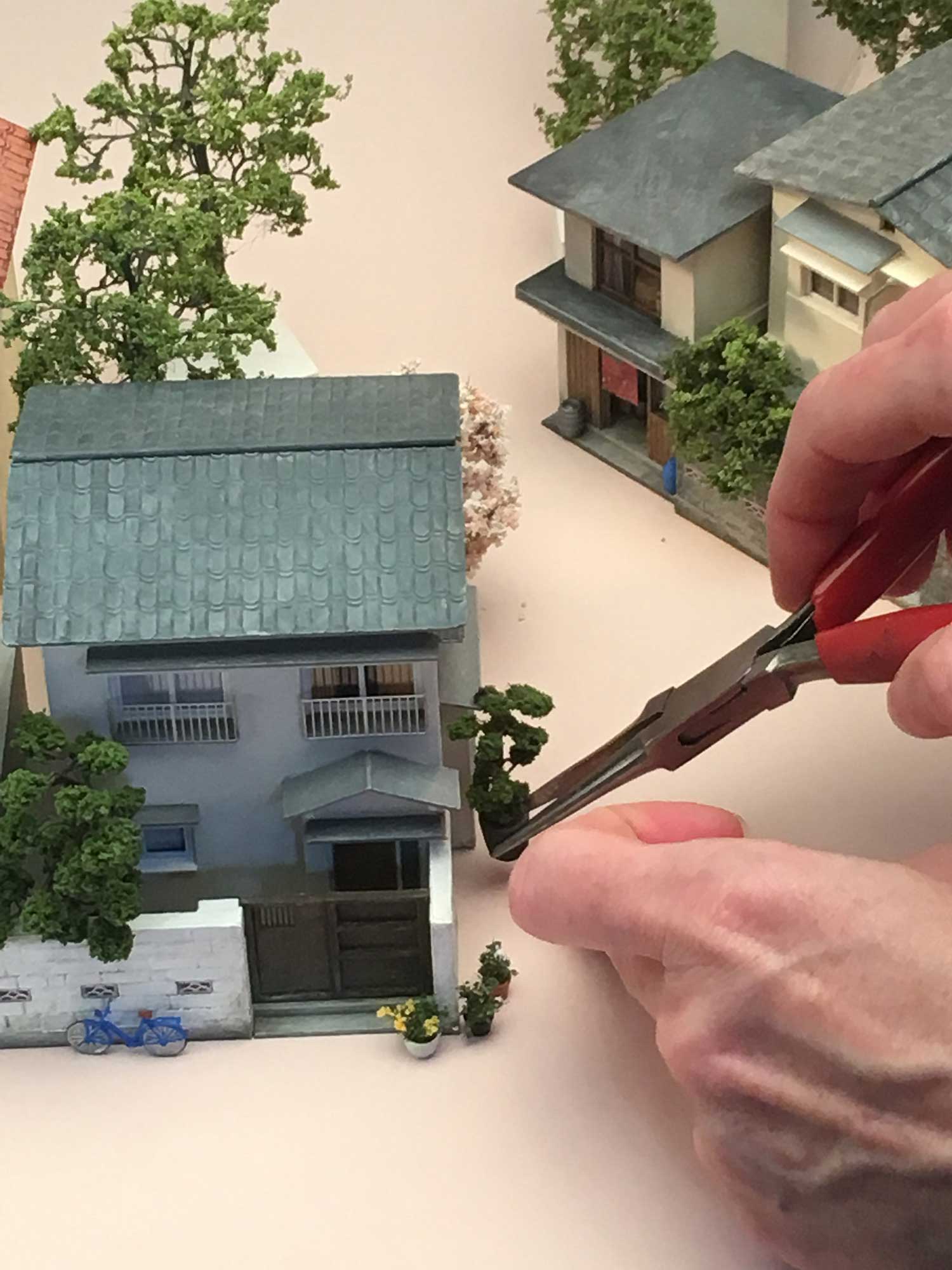
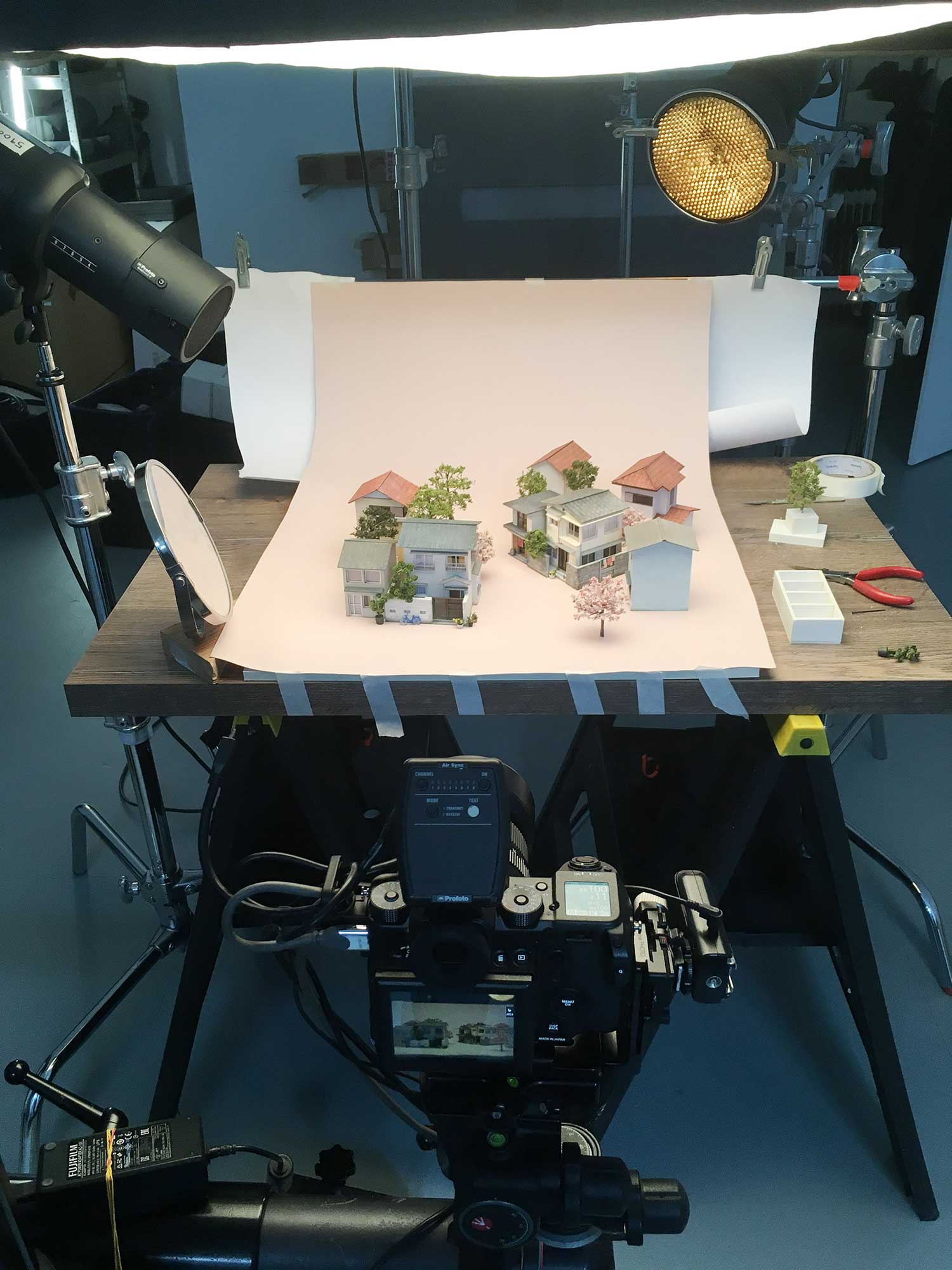
When I read Granta’s cover brief for Hiromi Kawakami’s People From My Neighbourhood (translated by Ted Goossen), what really stood out for me in their summary was the term ‘micro fiction’. I was intrigued by the idea of a super short-story format – which offers only glimpses of the characters’ lives, and how they might all intersect. I wanted the cover to reflect a sense of a community, showing people going about their lives in an ordinary moment on an ordinary day. It was also important that the cover responded to scale in an interesting way, to reflect the structure of the writing.
I took inspiration from ‘miniature art’, where tiny figures and found objects are combined to create photographic compositions which play with scale and narrative. It felt like an appropriate direction for the cover – to make a physical neighbourhood at a micro scale. As I considered how I might translate this idea into the production of a cover, a chance conversation with a studio mate led me to model-maker Karen Britcliffe.
Rather fortuitously, I had just returned from a first-time trip to Japan, so when I was putting together the brief and references for Karen, I had all these specific architectural details fresh in my mind, which I think I might have missed if I’d had to rely solely on online research, such as the way greenery is squeezed in to the smallest of urban spaces. But it was Karen’s attentiveness and sensitivity to the text which really brought the narrative and the visual elements together. And it was her training as a theatre designer that led her to suggest the perspective and the way the buildings would reveal themselves:
The storytelling is so descriptive that I could visualise a neighbourhood quite quickly, the style of buildings and where they would sit and the people that would inhabit these homes. I wanted to create a street corner, unexpected and lovely meetings seem to happen on them, and central to this had to be the old man’s house – the community’s longest resident – a man who raised chickens and whose farming land had founded the neighbourhood.
Before Karen could create the final set, she made several ‘white card’ iterations of it, so we could identify the desired scale and perspective, and how the characters might interact with it. There’s an added difficulty of working in three dimensions when the final product will be in two: you have to photograph it so that everything will end up in the correct place on the two-dimensional layout. Karen would email iPhone photos of the white card versions, and then I would place them into the digital layout of the cover, before sending to Granta to approve. Once approved, Karen could then begin making the final models.

On the day of the shoot, it was really exciting to see the miniature neighbourhood materialise, as pieces of the set were painstakingly assembled on the pale pink backdrop. The smallest of movements in any direction would make a huge difference to the perspective in-camera, so it took a long time to perfect. Working at a scale of 1:87 was particularly challenging when populating the set with the characters (both human and animal), which were only a few millimetres tall – all carefully chosen by Karen to reflect the subjects of the stories. We worked with photographer Martin Slivka, who lit the set beautifully, introducing a sense of early morning sun on the buildings, which really brought it all to life.
It’s rare in book cover design to be given the opportunity to work in three dimensions as the stakes are so high and the ability to edit so limited. Luckily, Granta supported the idea – and thanks to the contributions of two amazingly skilled practitioners – the end result is a cover that I hope will resonate with both new and existing readers of Kawakami’s writing.


