The making of a Granta cover
Michael Salu
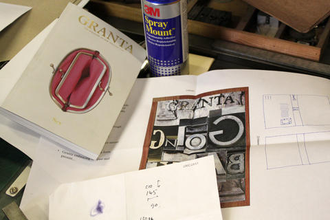
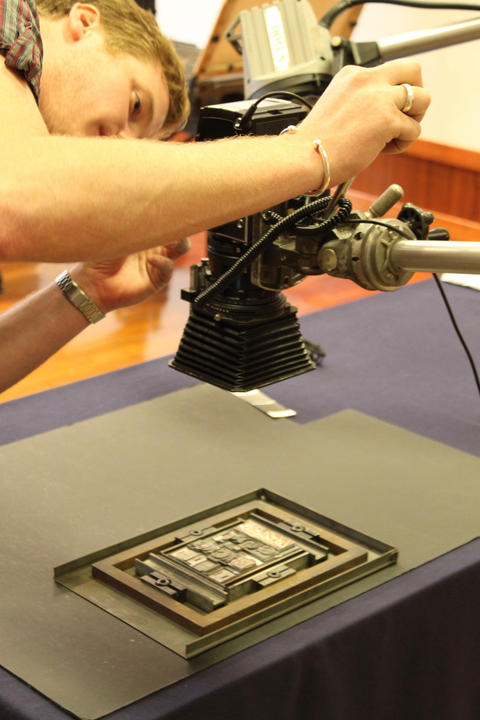
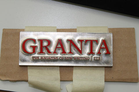
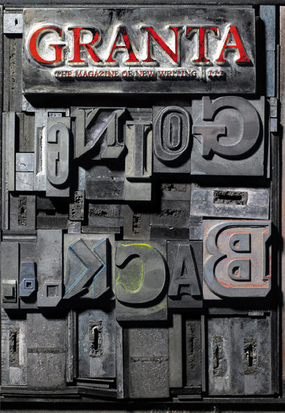
Granta’s artistic director Michael Salu tells of how the cover of the new issue of the magazine – which features a deeply textured photograph of type blocks, complete with their leading, that spell out the theme ‘Going Back’ – came into being. The slideshow above shows some of the stages of the process. The issue is out in England Monday July 12th, and July 26th in the US.
Granta 111, ‘Going Back’, is largely about memory. How do we preserve memory and deal with the marks it has left? Many of the written pieces in the issue – an agile but emotional collection of fiction, non-fiction, poetry and photography – look at memory and its physical imprints, often tackling the ravages of war and industry.
Initial brainstorming at Granta on how to visualize memory concluded that the cover itself needed an industrial veneer, something textured, aged and primed with history and wisdom. I began to think about how our preservation of memory has evolved over the years and considered how memory is becoming increasingly virtual (with even its meaning changing somewhat). Creating a cover for this issue seemed the ideal opportunity to produce something in homage to antiquated and largely obsolete processes.
After quick-fire discussion with the Granta team, I decided the most apt response to the text would be to create a typographic cover comprised of pieces of metal type used on old printing presses. These letterforms usually appear backwards in order for the type to print the correct way around on the press, which seemed a perfect conceptual fit for our theme, GOING BACK. I simulated a quick mock-up in Photoshop, using a variety of typefaces and styles to create the title, in a way that I think compliments the flexibility of the pieces within.
For this concept to work, we needed to strive for authenticity – to create the physical object ourselves. The typefaces would need to be sourced, traditionally hand-set and photographed to give the cover the depth that the issue deserves. For this I approached St Bride Printing Library, which has long been a place of fascination and wonder for me. My first visit to the library – with its oil, wood and metal, its smell of history – made a huge impression on me.
Nigel Roche and his incredibly knowledgeable, affable team helped make this a reality. My rough visual was enough for them to work from and they set about putting together a cohesive composition. A selection of typefaces was taken from their archive and all the type on the title and back cover was hand-set by Kim Vousden – a talented typographer and designer – who volunteers at the library. With her remarkable patience for one so young – a quality evocative of the typesetters of old – she meticulously pieced together my composition in order for us to photograph it for the cover. Even the grip used to hold the type on a press is a feature of our imagery, diffusing atmosphere down to the last detail.
For the cover to work as a whole, the magazine’s masthead needed to be manufactured in a similar way. We set about finding a company that could create a cast from metal of our brand typeface Plantin, to fit with the rest of the piece. Photocast Products in Liverpool did so obligingly and swiftly, also adorning the type with the red of Granta’s branding.
The photography was done by still-life photographer Giles Jenykn. We had worked together previously on something just as intricate, producing laser-cut, smoke-addled visuals for sleeve artwork on Tricky’s deluxe edition of his album ‘Maxinquaye’, so I knew he would be perfect for capturing visceral intensity and memory in this piece. It was a team effort: Kim fastidiously tweaked and made any necessary modifications on the day and Giles busied himself with his immaculate attention to detail, while cups of tea and typography-specific conversation flowed…
We at Granta are ecstatic with the end result – and much indebted to St Bride. The cover hums with an industrial intensity evocative of the dynamic changes of our recent history – appropriate for an issue of our magazine that carries the heartfelt memories of writers from Iris Murdoch to Mark Twain.


